

In today’s digital world, design is not just about making things look beautiful. It is about guiding attention. Whether someone visits a website, reads a blog, opens an app, or sees a social media post, their brain instantly decides what to look at first. This process happens in milliseconds, and it is controlled by something designers call visual hierarchy.
Visual hierarchy is the arrangement of elements in a design so that users naturally focus on the most important information first. Good designers don’t rely on luck; they use psychology to guide the viewer’s eyes.
Understanding the psychology of visual hierarchy in design can dramatically improve how people interact with websites, advertisements, and digital products. When used correctly, it increases readability, engagement, and even conversions.
This expert guide will explain how visual hierarchy works, why our brains respond to it, and how designers can use it to create powerful and effective designs.
What Is Visual Hierarchy?
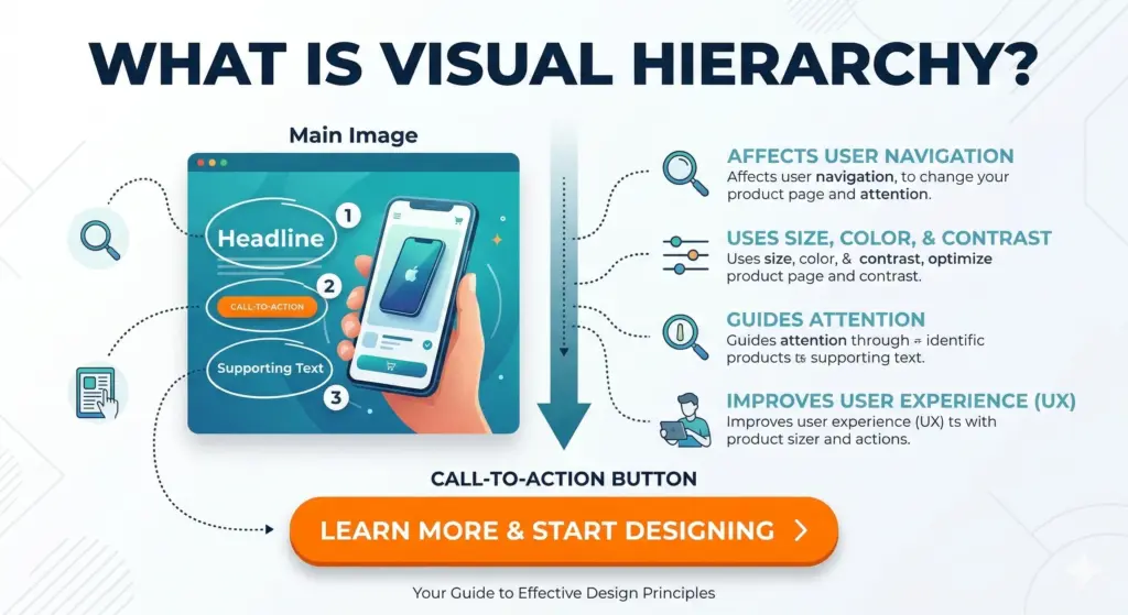
Visual hierarchy refers to the order in which the human eye perceives information in a design. It determines which elements attract attention first, second, and third.
For example, on a well-designed website page, the viewer might notice:
- The headline
- The main image
- The call-to-action button
- Supporting text
This sequence is not accidental. Designers intentionally control the layout using size, color, contrast, spacing, and positioning.
Without visual hierarchy, a design becomes chaotic. Users don’t know where to look, and they often leave quickly.
Why Matters Psychology of Visual Hierarchy in Design
Human attention is limited. When people encounter too much information at once, the brain filters what seems most important.
Visual hierarchy helps the brain process information quickly and efficiently.
Here are some reasons it is critical in design:
1. Improves User Experience
When information is organized logically, users can understand content without effort. They don’t need to search for what matters.
2. Guides Decision Making
In marketing and web design, hierarchy can lead users toward actions such as:
- Clicking a button
- Reading an article
- Signing up for a service
3. Reduces Cognitive Load
Too many equal visual elements overwhelm the brain. Hierarchy simplifies the experience by creating clear priorities.
4. Increases Engagement
When content is easy to scan and visually appealing, users stay longer and interact more.


The Psychology Behind Visual Hierarchy
Visual hierarchy works because it aligns with how the human brain processes visual information.
Our brains evolved to quickly detect patterns, contrasts, and differences. This ability helped humans identify threats and opportunities in the environment.
Designers apply these same psychological principles.
Pattern Recognition
Humans naturally look for patterns and structures. Organized layouts feel comfortable and trustworthy.
Attention to Contrast
The brain immediately notices differences such as:
- Bright vs dull colors
- Large vs small elements
- Light vs dark backgrounds
Visual Scanning Behavior
Studies show that people often scan web pages in patterns such as:
These patterns influence how designers place important elements.
Visual hierarchy also plays a major role in modern SEO strategies, because search engines now prioritize user experience and readability.
Key Elements That Create Visual Hierarchy

Several design techniques help establish strong hierarchy.
1. Size and Scale
Larger elements naturally attract more attention than smaller ones.
Headlines are typically the largest element because they communicate the primary message.
Example structure:
- Large headline
- Medium subheading
- Smaller body text
This size difference helps readers understand importance instantly.
2. Color and Contrast
Color plays a major psychological role in directing attention.
High contrast elements stand out immediately.
For example:
- Bright call-to-action buttons on neutral backgrounds
- Bold colors for important messages
Contrast creates visual emphasis and prevents important elements from blending into the background.
3. Typography
Typography strongly influences readability and hierarchy.
Designers use different font weights and styles to structure information.
Typical hierarchy might include:
- Bold headline
- Medium subheading
- Regular paragraph text
Spacing between lines and letters also affects how easily the brain processes text.
4. Position and Layout
Where an element appears on the screen affects its importance.
Users usually look first at:
- The top of the page
- The center area
- The left side of content
Placing critical elements in these zones increases visibility.
5. White Space (Negative Space)
White space is one of the most powerful yet overlooked design tools.
By leaving empty space around an element, designers make it stand out.
Minimalist designs often rely heavily on white space to highlight key messages.
White space also improves readability and reduces visual clutter.
6. Alignment and Grouping
The human brain naturally groups related elements.
Designers use alignment and spacing to create relationships between items.
For example:
- Navigation links placed together
- Icons grouped with their labels
- Sections separated by space
This technique helps users quickly understand structure.
Real-World Examples of Visual Hierarchy
Visual hierarchy appears everywhere in modern design.
Websites
A well-designed website homepage typically follows this hierarchy:
- Hero image or headline
- Value proposition
- Call-to-action button
- Supporting content
This structure helps visitors understand the website instantly.
Mobile Apps
Mobile interfaces rely heavily on hierarchy because screens are small.
Designers prioritize:
- Primary actions
- Key notifications
- Essential information
Clear hierarchy ensures users can navigate easily.
Social Media Graphics
On social media, attention spans are extremely short.
Designers use hierarchy to ensure users immediately see:
- The main message
- The brand identity
- The call to action
Without hierarchy, posts are ignored while scrolling.
Common Visual Hierarchy Mistakes
Even experienced designers sometimes create ineffective hierarchies.
Here are some common mistakes.
Too Many Competing Elements
If everything looks important, nothing is important.
Designs should highlight only a few key elements.
Poor Contrast
Low contrast makes text difficult to read and reduces visual clarity.
Designs must ensure sufficient difference between background and content.
Overuse of Colors and Fonts
Using too many styles creates confusion.
A good design typically uses:
- 2–3 fonts
- 3–5 main colors
Lack of Spacing
Crowded layouts overwhelm users and reduce readability.
Proper spacing improves structure and comprehension.
How Designers Can Improve Visual Hierarchy
Designers can apply several practical strategies to improve hierarchy.
Start With the Primary Goal
Every design should answer one question:
What action should the user take?
The design hierarchy should support that goal.
Use the “Squint Test”
When you squint at a design, only major shapes and contrasts remain visible.
If the most important element is still noticeable, the hierarchy is working.
Follow Scanning Patterns
Design layouts that match natural reading behavior such as the F-pattern or Z-pattern.
Test With Real Users
User testing often reveals whether viewers understand the intended hierarchy.
If users struggle to find key information, the design needs adjustment.
The Future of Visual Hierarchy in Digital Design
As digital interfaces evolve, visual hierarchy will become even more important.
Modern technologies such as AI interfaces, voice interaction, and augmented reality still rely on clear visual structures.
Design trends are shifting toward:
- Minimalist layouts
- Micro-interactions
- Personalized interfaces
However, the psychological principles behind visual hierarchy remain constant.
Human brains still respond to contrast, scale, and organization.
Designers who understand these principles will continue to create experiences that feel intuitive and engaging.
Frequently Asked Questions (FAQ)
1. What is visual hierarchy in design?
Visual hierarchy is the arrangement of design elements in a way that guides viewers to the most important information first. It helps users understand content quickly and easily.
2. Why is visual hierarchy important?
Visual hierarchy improves readability, enhances user experience, and directs attention toward key messages or actions such as buttons or headlines.
3. What are the main elements of visual hierarchy?
The main elements include size, color, contrast, typography, spacing, alignment, and layout positioning.
4. How does psychology influence visual hierarchy?
Human brains naturally focus on differences in size, color, and contrast. Designers use these psychological tendencies to guide attention effectively.
5. What is the F-pattern in design?
The F-pattern describes how users typically scan text-heavy web pages — starting at the top, moving horizontally, and then scanning down the left side.
6. What is the Z-pattern layout?
The Z-pattern layout follows the natural eye movement from top left to top right, then diagonally to the bottom left, and finally to the bottom right.
7. How can beginners improve visual hierarchy?
Beginners can improve hierarchy by using larger headlines, strong contrast, clear spacing, limited colors, and simple layouts that guide the viewer’s attention.
8. Can visual hierarchy increase website conversions?
Yes. A clear hierarchy directs users toward calls to action, making them more likely to click buttons, subscribe, or make purchases.
